

Dulux announce Colour Futures 2016
September 17th, 2015
Every year, AkzoNobel’s global aesthetic centre gather experts from around the world to monitor fashions and forecast trends. At their Colour Futures 2016 launch this week they showcased the thoughts and influences behind the ‘Looking Both Ways’ concept for 2016 and Brewers were there to hear from the panel first hand.
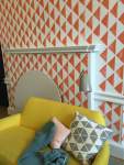
The Dulux colour of the year 2016 is an ochre gold which they say is a colour “that would connect with the overall trend of looking both ways” and is the focus colour for the four palettes influenced by their ‘looking both ways’
theme; Dark & Light, Heritage & Future, Words & Pictures and The Grid & Letting Go.
The colours hope to influence a bolder approach to using deep colours to create a warmer environment in the home whilst injecting a light through contrasting colours. Using more muted tones than in previous years the palettes draw influence from the typical photo filters used on social media and forward thinking architectural and design.
We feel the colour collections bring a modern twist to the 1970s vibe that we’re seeing in fashion, from clothes to soft furnishings.
Colour is life enhancing, and encouraging your customers to choose colours for their walls and ceilings will bring new warmth and personality to their homes.
To view the full Colour Futures collection click here.

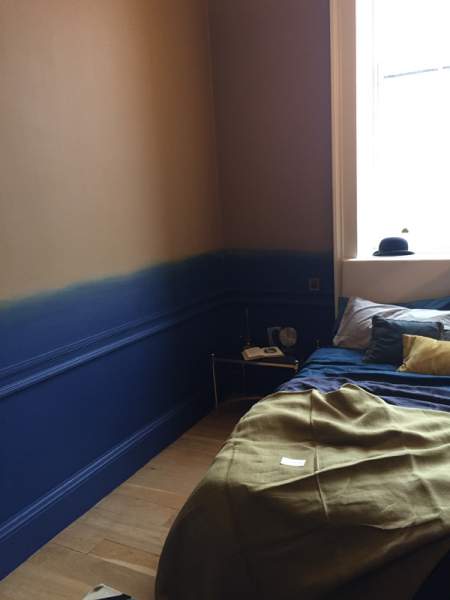
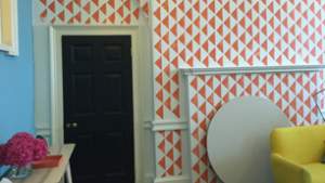
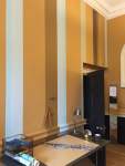
Dulux Colour Futures 2016
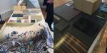
Beautiful example roomsets and the influences behind the colours


Timeline
Dulux colours of the PAST
- 2016
- CF16: Ochre Gold
- 2015
- CF15: Copper Blush
- 2014
- CF14: Teal
- 2013
- CF13: Indigo
- 2012
- CF12: Firecracker 4